ChordSet
View on Github ︎ChordSet Overview
Since the adoption of the graphical user interface - icons and toolbars have become an increasingly important part of applications. As apps grow in complexity icons, are able to provide concise and convenient ways to complete an intended action. On the other hand, scrolling through a large menu, or finding the correct icon graphic on the toolbar, takes time.
Because of this keyboard shortcuts have been implemented into modern day applications to increase the effectiveness of a program, however no matter the significant time gains one can uncover by using keyboard shortcuts, both users and experts still prefer interacting through directly through the user-interface.

Mean reported frequency of method use as a function of command.
The above graphic is from the “Hidden Costs of Graphical User Interfaces” research paper from Rice University, which describes that despite the fact a user can save over 2 seconds while using a keyboard shortcuts, they without a doubt favored interacting directly with the user interface.

Intended learning curve for ExposeHK, compared with modality switching.
Research from ExposeHK, cites John M. Carroll’s ‘paradox of the active user’ suggesting that users are too engaged in their tasks to consider learning keyboard shortcuts. And the longer it takes to learn a shortcut, the longer the performance dip.
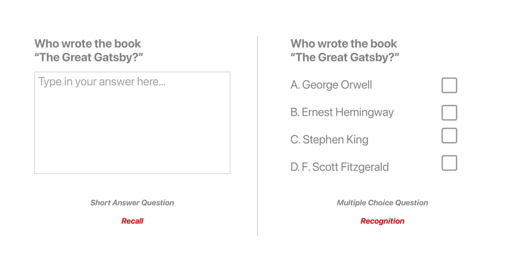
Recognition vs Recall in a quiz like setting
Lastly, through a great article by Ty Walls, I learned that keyboard shortcuts rely on memory recall, instead of recognition, taking a lot of brain power in order to execute a keyboard command. If you look at the above graphic, you can see that coming up with the answer, of “Who Wrote The Great Gatsby,” is a lot easier if you have contextual hints to refresh your memory.One may say, “But there is a system…”
Finding a shortcut by navigating through a UI menu hierarchy
Yes, although you can access shortcuts by navigating the list on the GUI or reading application manuals, there are 3 issues with this.
1. You have to take your off of the keyboard in order to find the shortcut.
2. Modifier key symbols (⌘,⌥, ⌃,⇧) are difficult to understand.
3. It is difficult to spatially map the complex symbols to their position on the keyboard

Snippet from Clair de Lune(left) and Menu Hierarchy with Shortcuts(right)
So what’s the difference between reading a piece of sheet music and learning a keyboard shortcut? Both provide users with instructions from an interface to mapping a piece of information the keyboard.
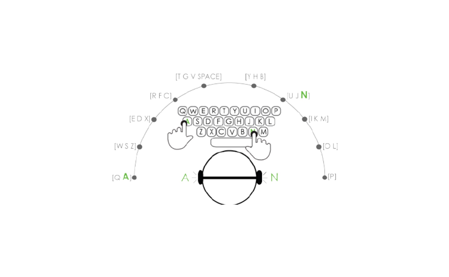 Spatially understanding the keyboard through pitches assigned to keys. (Unknown Source)
With sheet music the notes provide reference to different keys on an instrument which are understood by various pitches. This language is consistent across instruments, and enables the user to make sense of a larger system.
On the other hand, keyboard shortcuts, lack uniformity, and there is no clear reason as to why certain shortcuts are mapped to particular keys.
Overall, after gathering and understanding research, I learned that the primary reason that keyboard shortcuts are underutilized, is because they lack contextual relevance.
Approaching the Design
With an understanding of the problem I started to approach the design. My initial approach was twofold:
- Provide shortcuts in AR to the user based on current App
- Pass input from the Desktop to the AR keyboard

Sticky Note with All of my wife’s Shortcuts Written Down
I also had two specific use cases in mind.
- My wife, and my mother, keep a sticky note on their computer to help remind them of keyboard shortcuts. Interestingly enough these are only for shortcuts not easily found on the GUI. So I wanted to see if I could avoid the need for a sticky note.
- A more personal use case: Where I want to use a shortcut on Rider to call the “Move Next” command on the debugger - but I could not remember the specific key on which the command resides.
Current Solutions
–
“So, Andy, tell me, what are some currently available solutions to your problem?”

Well, off the bat, Apple solved this problem in 2007, with the launch of the iPhone, by removing all of the buttons from the screen, instead allowing apps to control how they are controlled.
This is the right solution. Nevertheless, there are today a group of people, professionals, experts and general consumers, that need to interact with a computer and a keyboard in order to complete their daily tasks.
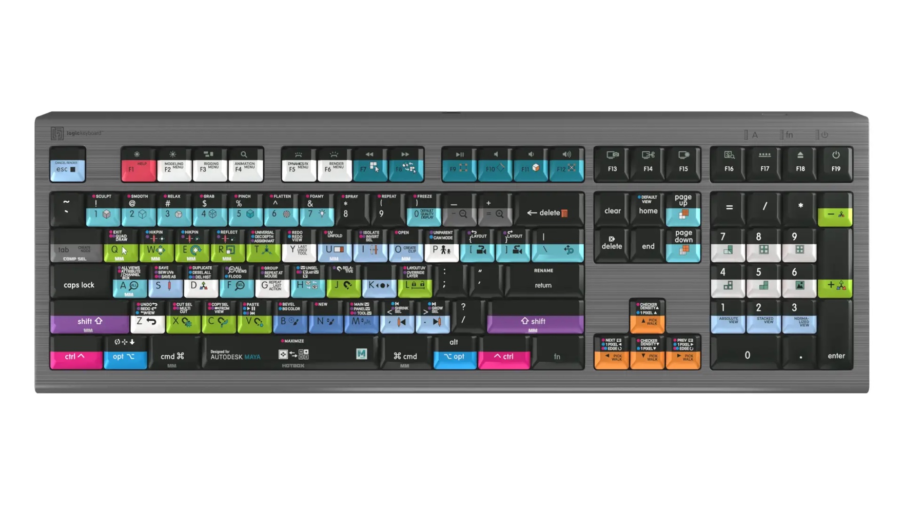
LogicKeyboard for Maya
There is also the Logickeyboard, as well as a various collection of keyboard covers, that aim to solve the problem by mapping all of the app’s shortcuts directly onto the keyboard. However these solutions have their own intrinsic issues. 1. Visually complicated.
2. Requires a seperate piece of hardware.
3. Application specific.
Other approaches including ExposeHK, IconHK, and Waldon Bronchart’s Application Shortcut Mapper, and HotKey Eve, although they don’t map directly on the users keyboard, are all valid approaches aiming to solve this problem, and served as valuable reference companions while designing the app.
Initial Designs
Accessing Specific Commands through a List
I started out by not solving for the contextual problem directly. Instead, I created a list where users can search for a particular command they are looking for, and have it mapped directly onto the keyboard. This can help make it faster to learn commands, shortening the “performance dip” making it more likely for someone to learn and recall a shortcut. However, I realized that a user would need to take their hands off the keyboard to interact with the list, which would take away from the purpose of the product to begin with.
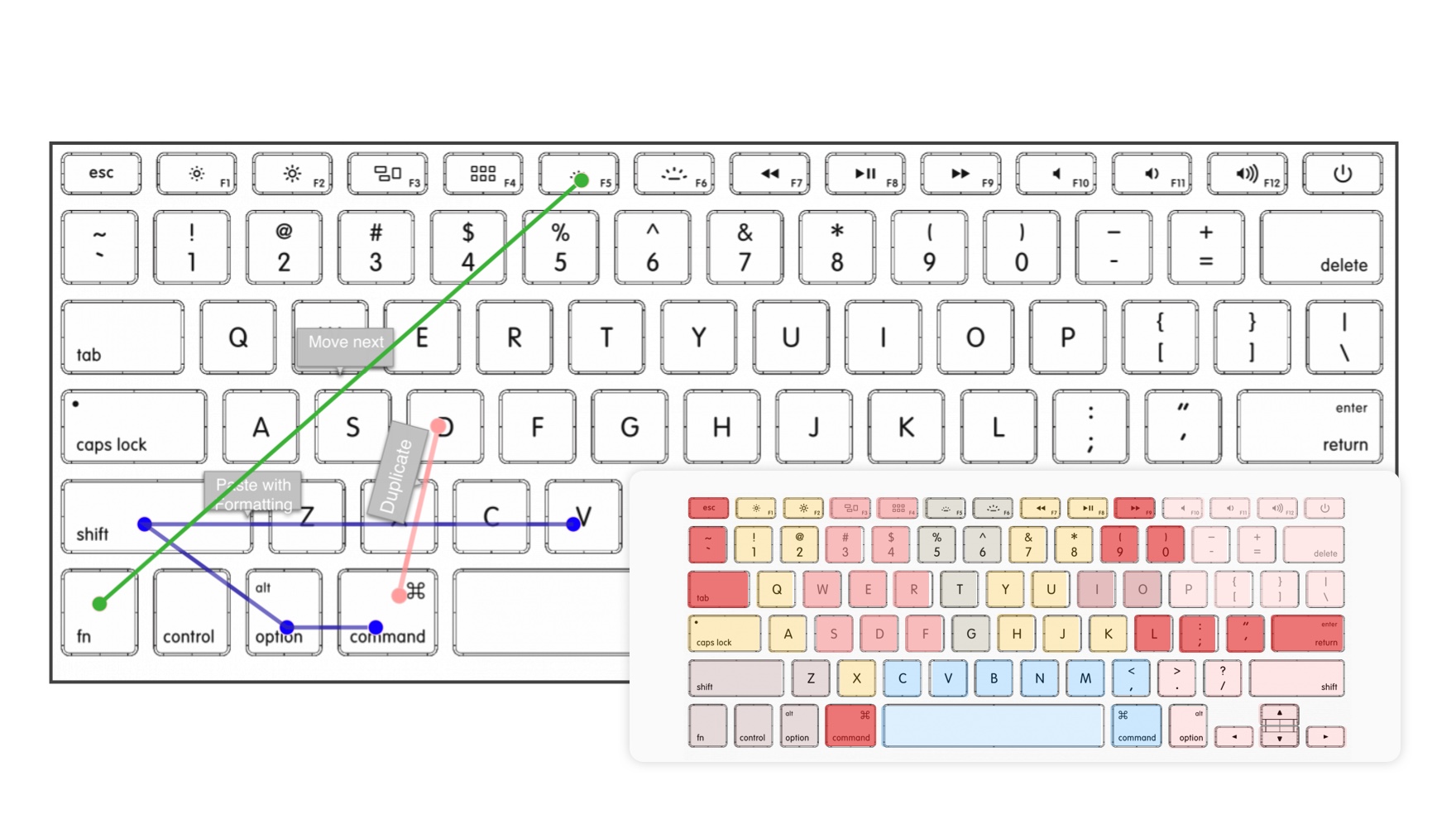
Exploring different options for displaying keyboard shortcuts directly on key
I tried some alternate methods to make it quick to access without needing to browse a list, but they were too complex. In the end, the list was the right approach, and could be interacted with using the keyboard.
Bringing Context to the Keyboard
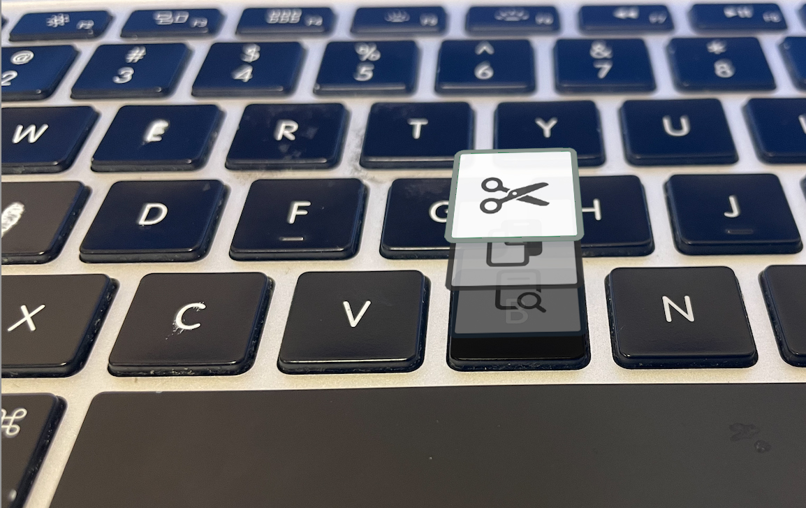
Understanding Various Key States
I wasn’t getting too far with the previous design so I decided to focus on recontextualizing the keyboard. The idea was to physically chance the letter on a key to display its current shortcut. The current shortcut would change based on what modifier was pressed. If there were no shortcuts available the key would then fade out to eliminate distraction.

Key Expands To Show More Details When Eye Is Focused On The Key
I started out by understanding how I could visually place the icon on the key. This was challenging because each key was very small, so I needed to be able to provide enough contextualization to have it clearly visible.
As you can see above, I tried leveraging an eye tracking mechanic so more information can be displayed when looking at a specific key. This level of eye-tracking percision is not available on my iOS device.
The IconHK research paper also displayed interesting approaches for visually animating between a letter and icon, which I was able to further explore with after effects.
Color Scheme at Various States and Association with Modifier Key
I worked to create a color scheme to associate the available shortcuts with their corresponding modifier key. I tried various color schemes, including leveraging a research paper, Does interior color contrast enhance spatial memory?which discussed that warm color schemes are most effective, in order to choose the appropriate color scheme for the keyboard.
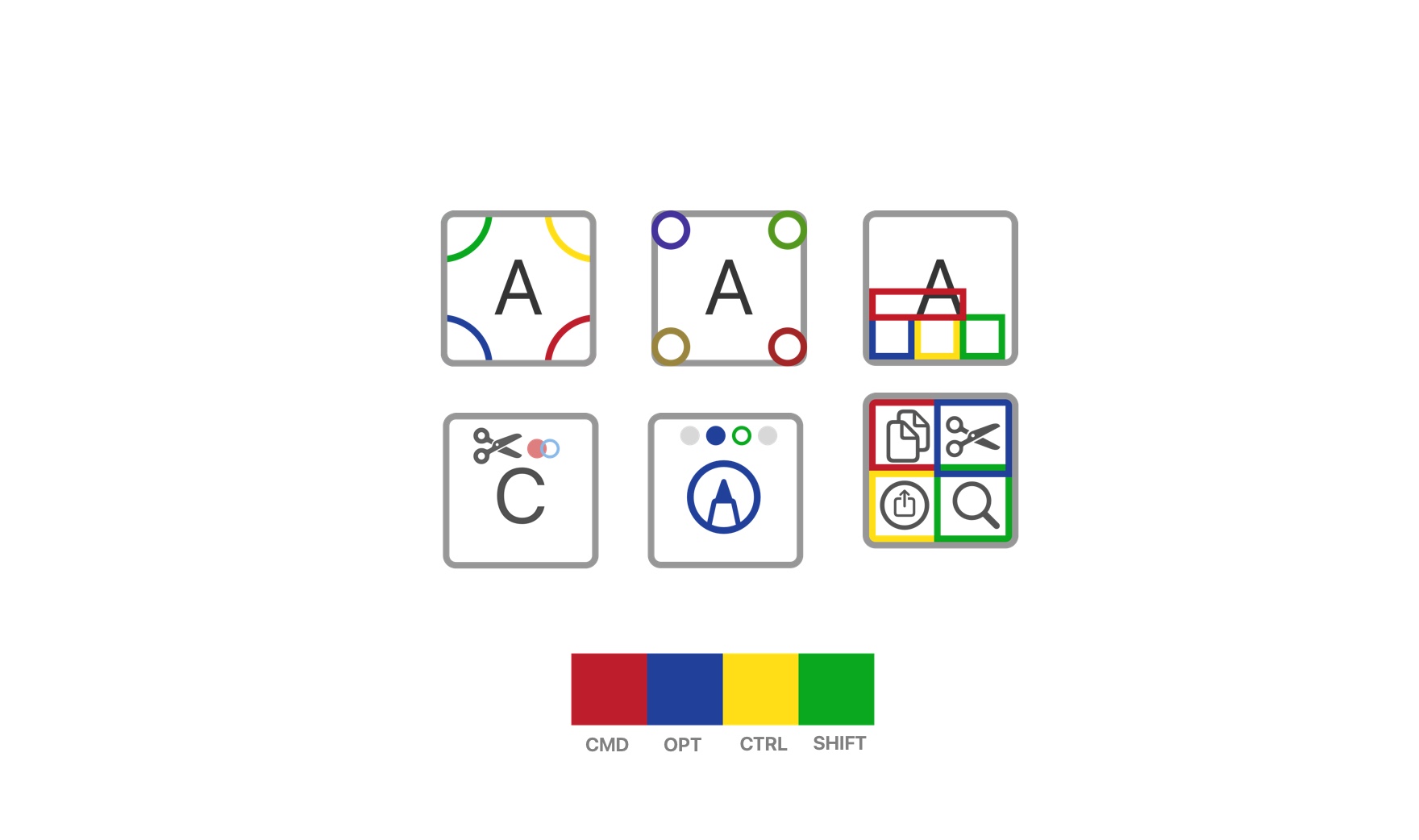
Exploring Ways to Showcase Future States on a Primary Key
Amidst the process, I realized that a user would be unable to see commands available in future states. And here, if they were looking for a specific command, there was no way to indicate a specific path. I explored various approaches of indicating to a user that a command is available in a different state, and worked with colors and location of the indicator in order to best portray the information.
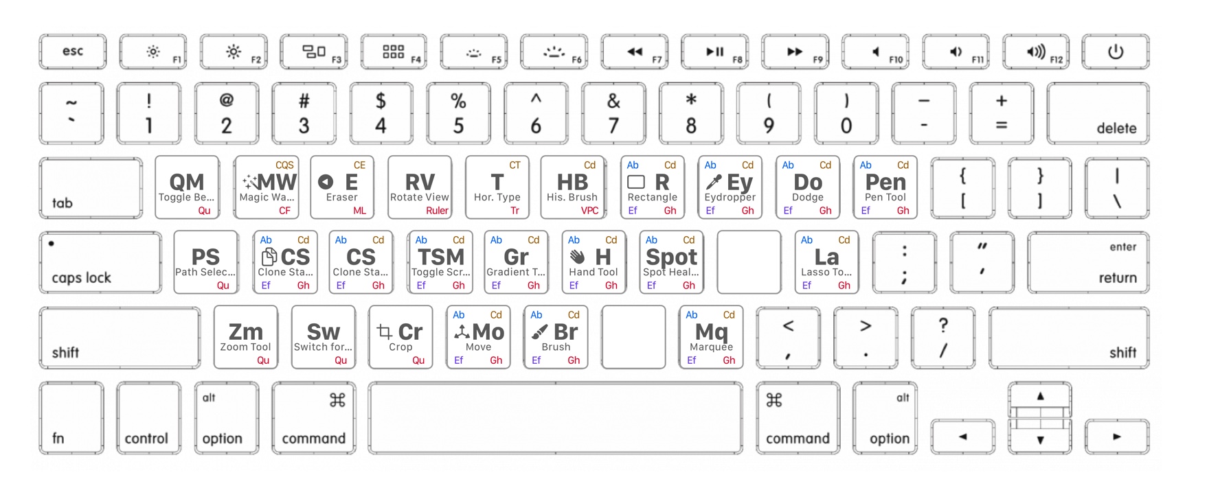
Periodic Table Keyboard Design
The keyboard was becoming visually overwhelming with too much information being presented at once. So I started thinking about different approaches.
I realized that there was a similarity between the periodic table and the keyboard. Interestingly enough, the goal of the periodic table is to clearly present a large amount of information at once.
So I took my previous designs, and referenced the periodic table to improve them by creating a naming system and symbols to provide consistency and readability across the keyboard.
Introducing Motion
After Effects Key Transition to Shortcut Design
After a good night sleep, I woke up thinking, “Who would actually want to use this” so I decided to explore how motion could help simplify the design. When working with After Effects, I realized that I could use animation to describe the shortcuts action in a small amount of space.
In addition, I explored overlaying the key with an identical graphic, so I could make it look like the actual key was transitioning, making the overall experience less visually overwhelming.
Simplifying the Desktop App
In order to simplify the desktop app I decided not to connect it to the currently open Mac application and instead use a simple text editor with built in shortcuts to start testing the app’s functionality and architecture.
Implementing the Design in Code
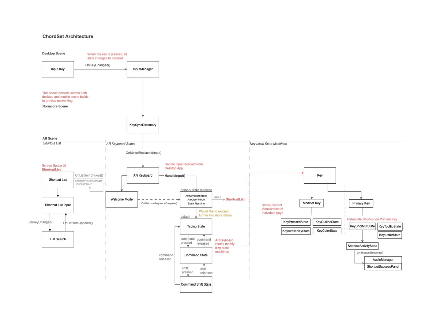
ChordSet Architecture
The app works off of two separate Unity builds, one is the Desktop App, and the other is the Mobile AR App. When a user inputs a key — the key is passed via an event from the Desktop through Normcore to the AR Keyboard.
Upon receiving the key input the AR Keyboard passes the input into the state machine, called Ambient Mode State Machine, which then displays the corresponding shortcuts in that state. Each state is associated with a specific modifier key (ie. The command-shift state, instantiates the screenshot, save as, and select all shortcuts on their respective key).
In addition, the keys themselves have local state machines that control the visualization of the key. The local key state machines are controlled directly from the Ambient Mode State Machine.

Local Scene(left), Placement Reticle for AR(right)
I then worked on setting up Normcore in order to understand the remote connectivity between the computer and the phone, implemented AR Foundation, so that I was able to accurately place the keyboard, and set up a local scene to test architectural concepts.Iterating Design through Code
Manipulating Current Key Shortcut in the Inspector
I set up all the key visualization states to be easily editable in the inspector, this way I was able to quickly explore the animations on the key without having to work with the desktop build in order to process input.
Displaying Shortcuts with Animations and 3D Objects
When I first started implementing the shortcuts I was exploring the use of 3D Objects and animations in order to further contextualize the meaning of the command on the key. Due to the complexity that each DoTween animation started becoming, I scaled back this concept to focus more directly on implementing the core features of the app. However I am interested in exploring this concept in the future.
Learning Mode Phase I Progression
As I was finalizing the contextual viewing of shortcuts, I realized there was no way for a user to find a specific shortcut. So I decided to implement learning mode as a substitute for a searchable list.
One of the interesting components of this design was that I tracked the computer screen in AR in order to let the user preview the action that a shortcut could perform.
Learning Mode Phase II with ‘caps-like’ learning button
I went through multiple learning mode phases, including an approach that worked through a concurrent state machine. Here, the user could continue using the keyboard, while at the same time, receiving hints about specific shortcuts of interest. In the end, the list proved to be the best solution for displaying specific shortcuts.
Welcome Animation with Recontextualized Space Bar
I also had a welcome mode animation play upon entering the app, enabling a transition into the experience. As you can see, I explored the role of recontextualizing the space bar to become a start button. Performance Issues
Profiler, displaying slow down to 15 frames-per-second
At a point in the code, I noticed that my project was slowing down on every key press. When looking into the profiler, I realized that this was due to the entire Normcore dictionary being iterated over on every keypress. After understanding the cause, I was able to adjust what was being sent to handle input, and drastically improve performance.
Although there are other areas that I could continue to improve, I decided to move forward and focus on building out the core functionality of the app, and a hope to revisit this in the future.
Looking Back
Upon completing the project, the area I would like to improve on most is my approach to the project’s architecture.
Although exploring through the design through code was an
amazing process. The project would have been a lot more efficient, and interesting, if this was was done in the beginning, not while going back and fourth on the final functionality of the App.
In specific, if I would have explored the idea of a list in the beginning, I would have realized the potential to interact with it through the keyboard, and could have focused more on the possibilities of that design.
To assess this in the future, I will spend less time on 2D designs and work more closely between Unity and the design, in order to make more informed architectural decisions.
Moving Forward

Taking the design in the future
It’s important that I move forward and continue building other work, but here are somethings that I would be interested in fixing.
- I would like to update the architecture again, to be more central around shortcuts. Shortcuts shouldn’t be instantiated on state, but should always be on their corresponding key. To keep track of what states could be made available, would depend on what key had certain shortcuts, and what ‘keys to access’ the shortcut needed in order to activate. This is largely based off of the list architecture that I started developing in the end.
- Further explore 3D and Particle Effects
- Expand the AR tracking into other areas of the computer, such as the screen, arm rests, or even the desk
- Push the project into other mediums, such as learning how to play piano, by processing the input being received from a Midi keyboard.
